ShopDreamUp AI ArtDreamUp
Deviation Actions


Suggested Deviants


Suggested Collections


![you can[not] redo](https://images-wixmp-ed30a86b8c4ca887773594c2.wixmp.com/f/fe7ab27f-7530-4252-99ef-2baaf81b36fd/d93ufkp-d23fcfb2-e503-4d1e-b127-9de4c26a0db5.png/v1/crop/w_184,h_184,x_29,y_0,scl_0.21957040572792,q_70,strp/you_can_not__redo_by_raikoart_d93ufkp-92s-2x.jpg?token=eyJ0eXAiOiJKV1QiLCJhbGciOiJIUzI1NiJ9.eyJzdWIiOiJ1cm46YXBwOjdlMGQxODg5ODIyNjQzNzNhNWYwZDQxNWVhMGQyNmUwIiwiaXNzIjoidXJuOmFwcDo3ZTBkMTg4OTgyMjY0MzczYTVmMGQ0MTVlYTBkMjZlMCIsIm9iaiI6W1t7ImhlaWdodCI6Ijw9NTUzIiwicGF0aCI6IlwvZlwvZmU3YWIyN2YtNzUzMC00MjUyLTk5ZWYtMmJhYWY4MWIzNmZkXC9kOTN1ZmtwLWQyM2ZjZmIyLWU1MDMtNGQxZS1iMTI3LTlkZTRjMjZhMGRiNS5wbmciLCJ3aWR0aCI6Ijw9OTAwIn1dXSwiYXVkIjpbInVybjpzZXJ2aWNlOmltYWdlLm9wZXJhdGlvbnMiXX0.jTO2ggOlehowLRjt5sGVhgR0GV2hzQlZIm3BI-p0gQg)
![you can[not] redo](https://images-wixmp-ed30a86b8c4ca887773594c2.wixmp.com/f/fe7ab27f-7530-4252-99ef-2baaf81b36fd/d93ufkp-d23fcfb2-e503-4d1e-b127-9de4c26a0db5.png/v1/crop/w_92,h_92,x_14,y_0,scl_0.10978520286396,q_70,strp/you_can_not__redo_by_raikoart_d93ufkp-92s.jpg?token=eyJ0eXAiOiJKV1QiLCJhbGciOiJIUzI1NiJ9.eyJzdWIiOiJ1cm46YXBwOjdlMGQxODg5ODIyNjQzNzNhNWYwZDQxNWVhMGQyNmUwIiwiaXNzIjoidXJuOmFwcDo3ZTBkMTg4OTgyMjY0MzczYTVmMGQ0MTVlYTBkMjZlMCIsIm9iaiI6W1t7ImhlaWdodCI6Ijw9NTUzIiwicGF0aCI6IlwvZlwvZmU3YWIyN2YtNzUzMC00MjUyLTk5ZWYtMmJhYWY4MWIzNmZkXC9kOTN1ZmtwLWQyM2ZjZmIyLWU1MDMtNGQxZS1iMTI3LTlkZTRjMjZhMGRiNS5wbmciLCJ3aWR0aCI6Ijw9OTAwIn1dXSwiYXVkIjpbInVybjpzZXJ2aWNlOmltYWdlLm9wZXJhdGlvbnMiXX0.jTO2ggOlehowLRjt5sGVhgR0GV2hzQlZIm3BI-p0gQg)


You Might Like…


Featured in Groups


Description
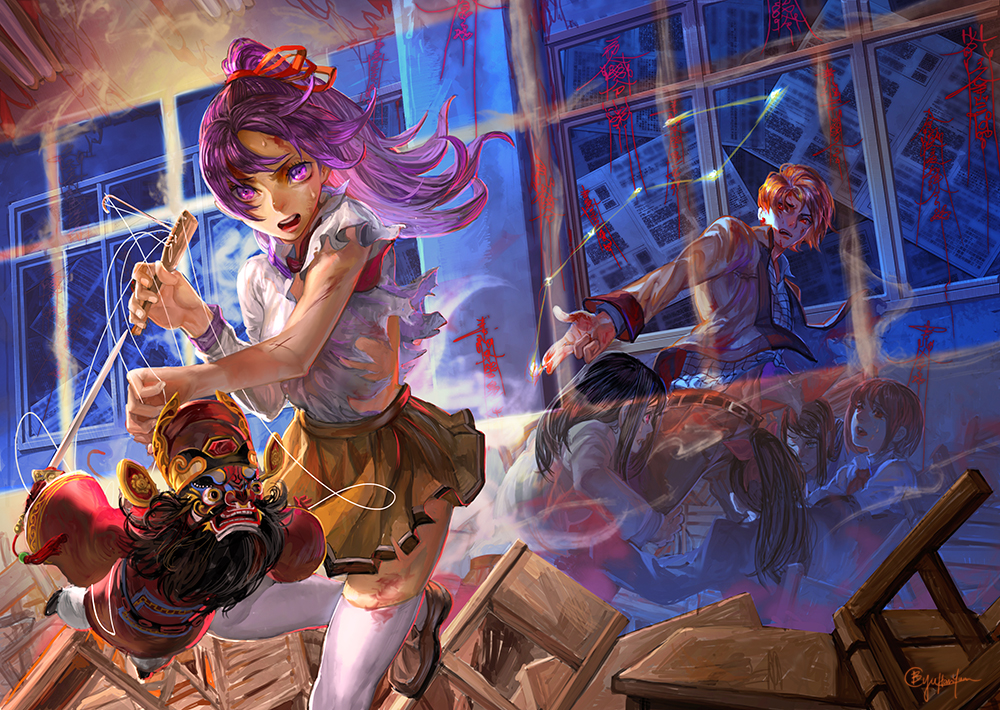
Exorcist Teacher volume5 cover: fools rush in where angels fear to tread
This is the fifth episode of the Exorcist Teacher which published by Spring publications.
The female character in the cover is fighting against evils by using the doll, the male character
in the background is protecting his students. To separate the characters into two spaces, I put
a wall which constructed by a mystical magic.
I was excited when I found the blue color in the background, I really love it. About the newspaper
on the windows in the background, originally I wanted to scan exist newspapers. In the end,
I did those newspapers by myself. It took me a while to finish it.
Hope you love this work!
Image size
1000x710px 909.12 KB
© 2015 - 2024 bcnyArt
Comments19
Join the community to add your comment. Already a deviant? Log In
overall I would say this work is a success. It exhibits great understanding of lighting, color, and composition, and only a few very, very minor issues. the first that I see is that the magic wall doesn't read too well right off the bat. When i first saw this, I assumed the students were ghosts or some kind of spirits because they have a lack of opacity. I would like to see that orange line in the wall be a little less prominent and the student's color pushed forward just a little bit, nothing drastic. in addition, It's very easily read as the girl is fighting the teacher because he is pointing directly at her and clearly casting some form of spell. I understand that his pointing is a compositional element meant to point the viewer's attention in her direction, but it also throws the immediate read off.finally, I would like to see the chairs in the foreground a little more renderred than their current state and some of the bloody writing on the back wall seems a little too fluorescent and that makes them read at in the foreground, not lying on a wall in the background.. some darker, browner reds could fix that.
overall, highly satisfying, clearly well done work with only a few minor suggestions!